Forte Mobile App Redesign and Build
Designing and building Forte’s Member app as their first UX/UI designer.
Role: Product Engineer and UX/UI Intern
Team: Lead Product Engineer, me, and a part-time Bubble.io contractor
Tools: Figma, Lovable, Claude, Bubble.io, ClickUp, Notion
TL;DR
Forte’s Member app was a desktop web app being used on phones. As Forte’s first designer, I redesigned it mobile first and tested it with users, and the product team collectively built it in Bubble.io. Members have completed almost 6,000 Mental Fitness Exercises since launch, and we’re now rebuilding the app from my Lovable designs.
Context
Forte is a Mental Fitness platform where employees meet one-on-one with a Coach and practice Mental Fitness Exercises. The idea is simple: the gym trains your body, Forte trains your mind.
The problem
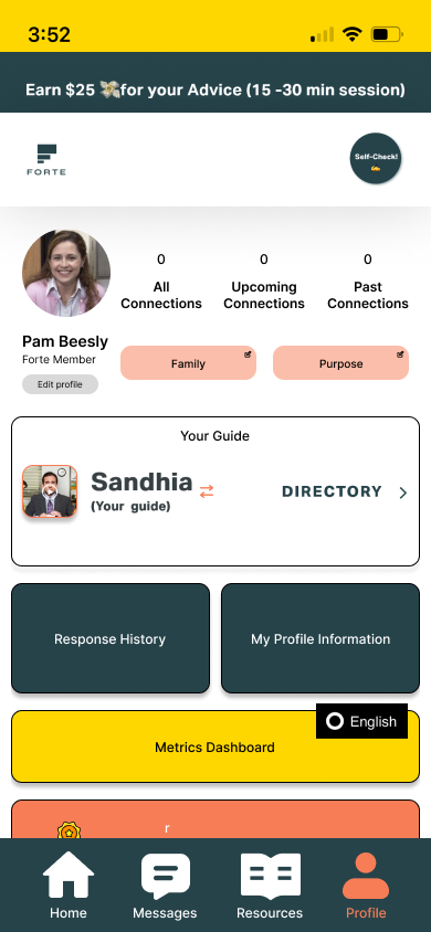
Forte’s app had grown feature by feature without a dedicated designer. It worked, but it was a desktop web app being used on phones, so it felt clunky and hard to navigate. With a rebrand and a shift in company direction underway, Forte needed someone to own the experience end to end, which is why they brought me on as their first designer.
My role
I owned the redesign and product direction for the new app, translated the designs into structured dev handoffs in our ClickUp sprint boards, and reviewed the team’s builds through QA and UI/UX review.
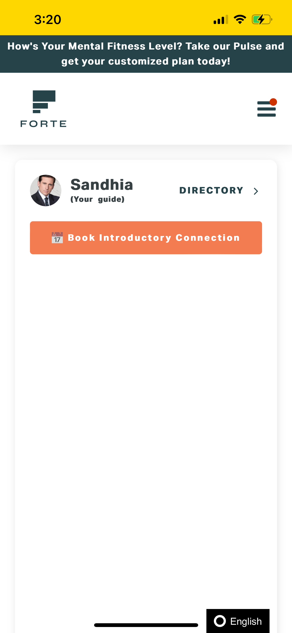
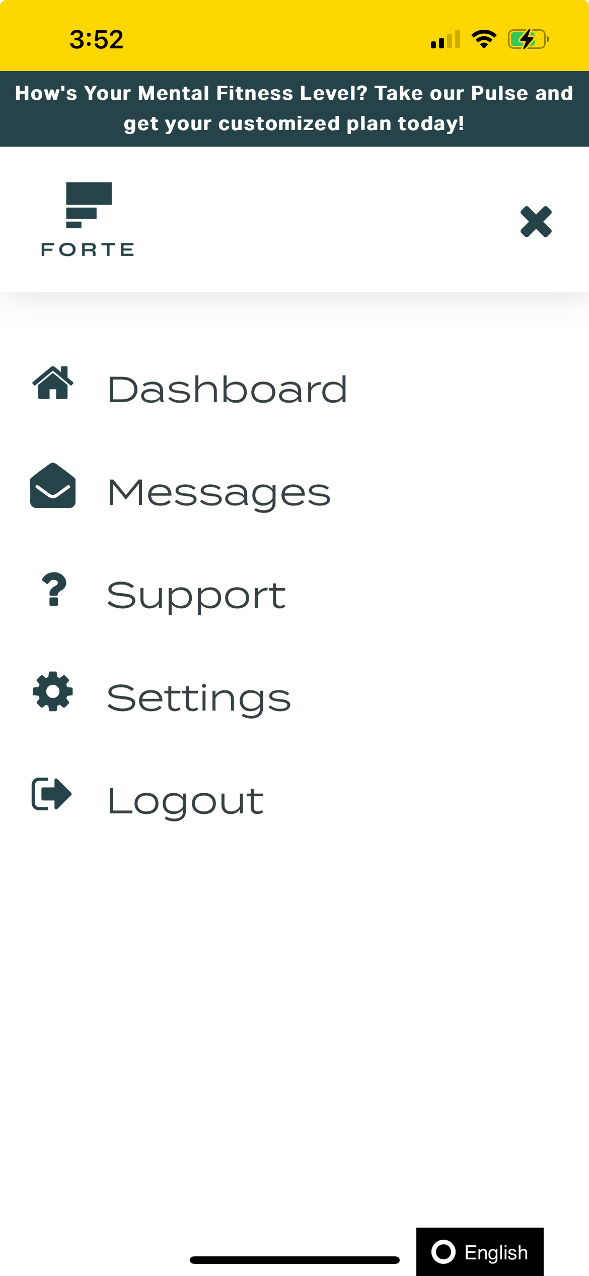
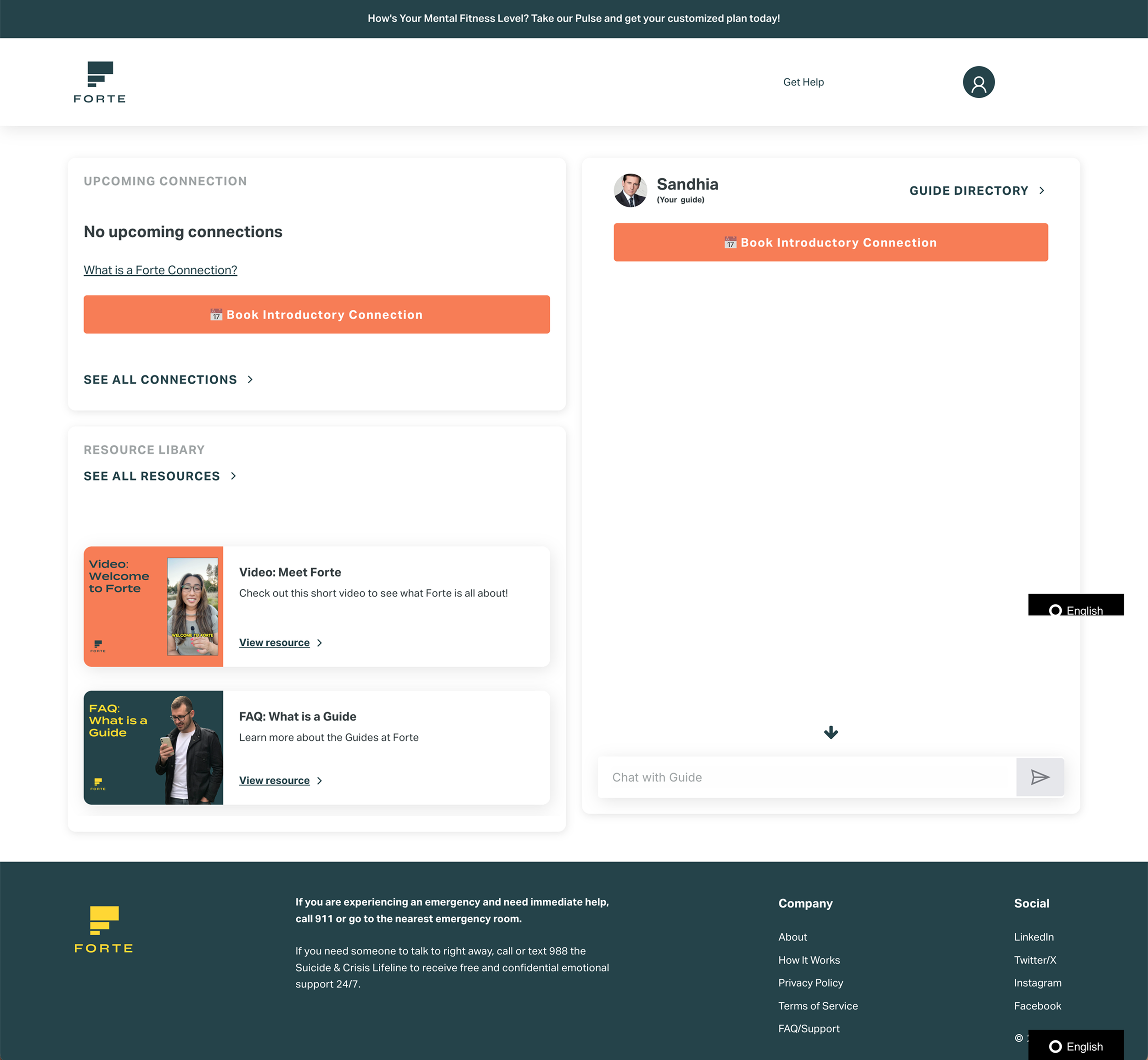
Original Web App
Process
I started by analyzing the existing app to find where it fell short. I redesigned it in Figma, then tested the designs in Useberry with about 40 testers across 4 rounds, implementing feedback after each round.
Once the Figma redesign was refined, our product team implemented it in the live Bubble.io app together. In parallel, I took the design further in Lovable, using AI to prototype faster.
Today, I assign tasks to our Bubble.io contractor and do QA and UI/UX review on his completed Bubble.io work. At the same time, our Lead Product Engineer is rebuilding the app from my Lovable designs with Claude Code, and I review his build and give feedback.
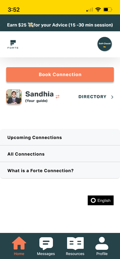
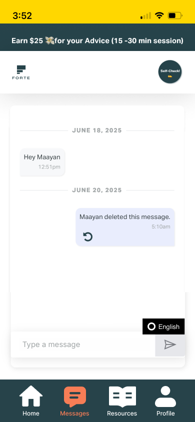
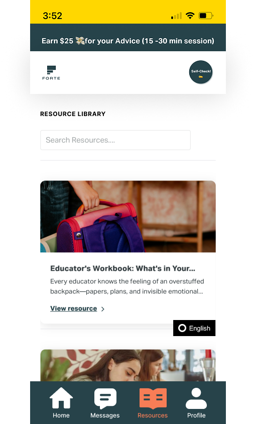
Initial Feature Updates
Key decisions
Mobile-first navigation and layout
Problem: The app was a desktop web app used mostly on phones, with no bottom navigation, so it felt clunky.
Choice: I redesigned it mobile first, starting with a bottom nav and a complete restructure of the layout.
Why: Members primarily use Forte for phone calls with their Coach, so designing for the phone was the most user-centered starting point.
Result: By the final round of Useberry testing, testers had stopped flagging major issues.
→
→
Original App Dashboard
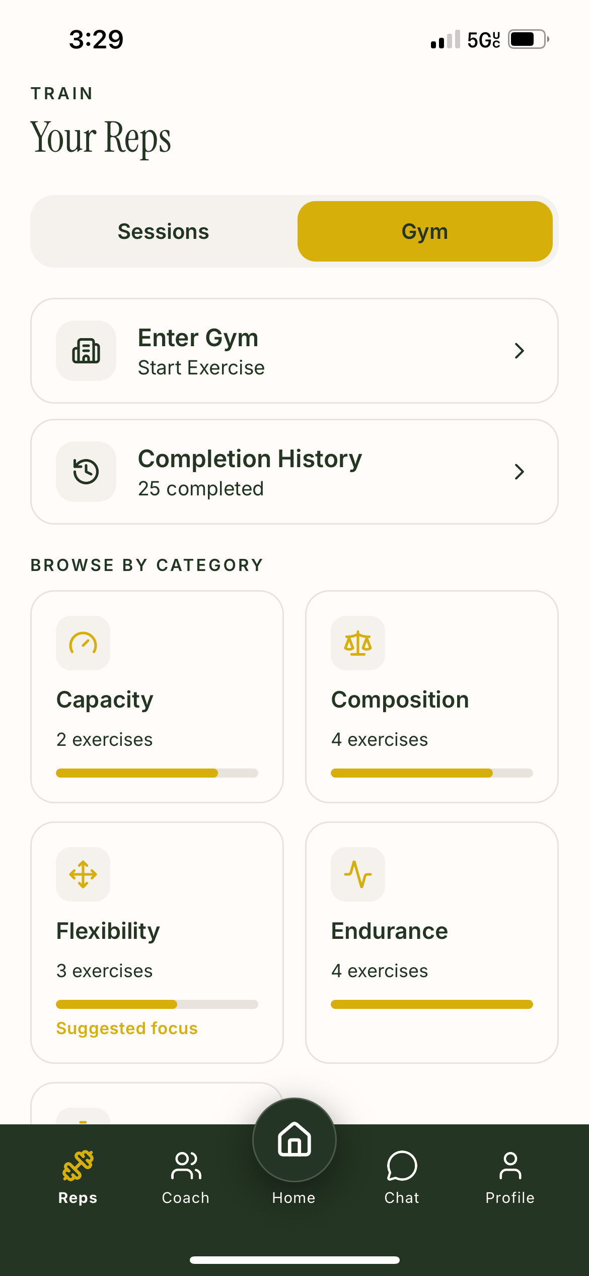
The Gym
Problem: The Gym was the newest and least developed part of the app, and Members rarely used it.
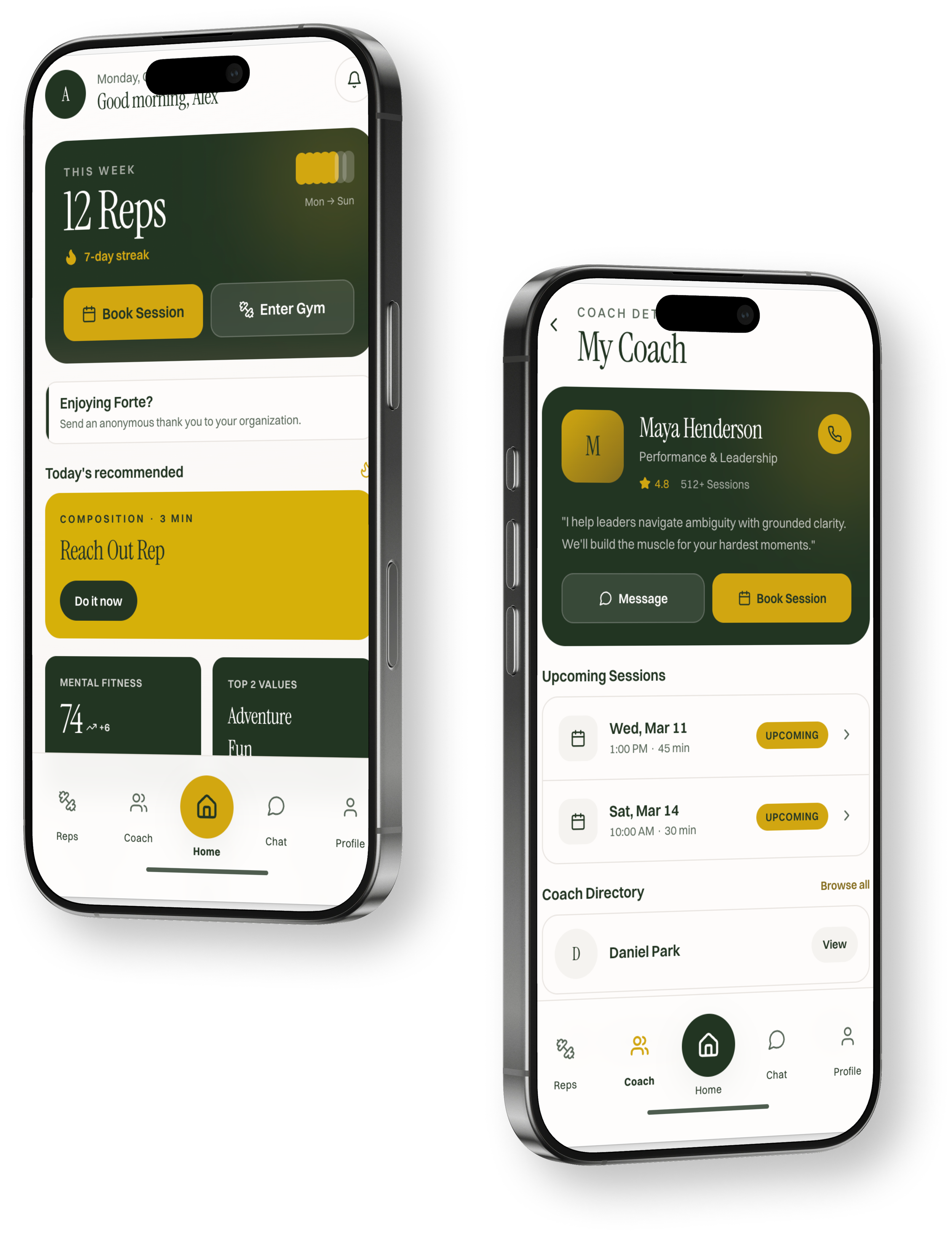
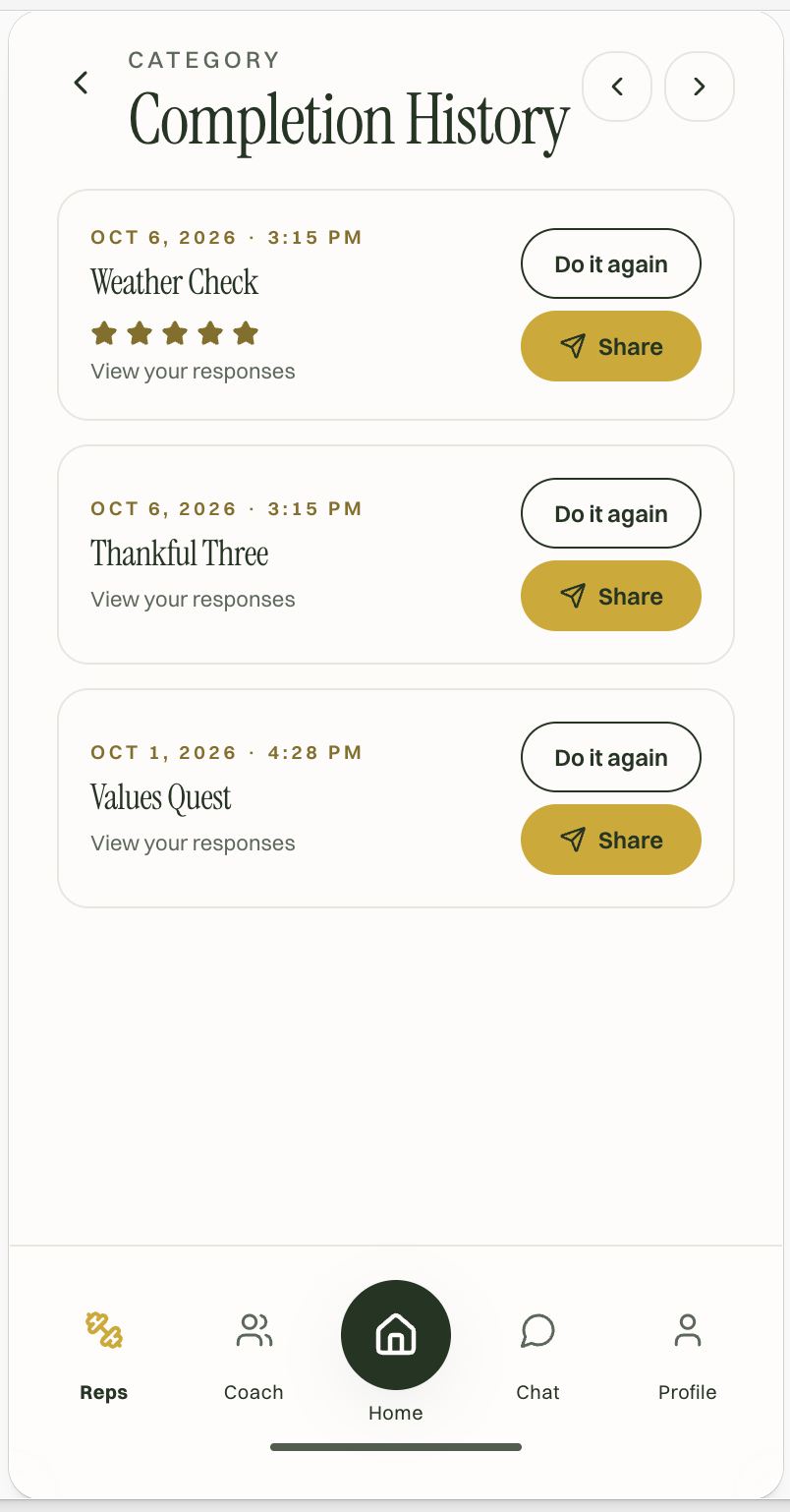
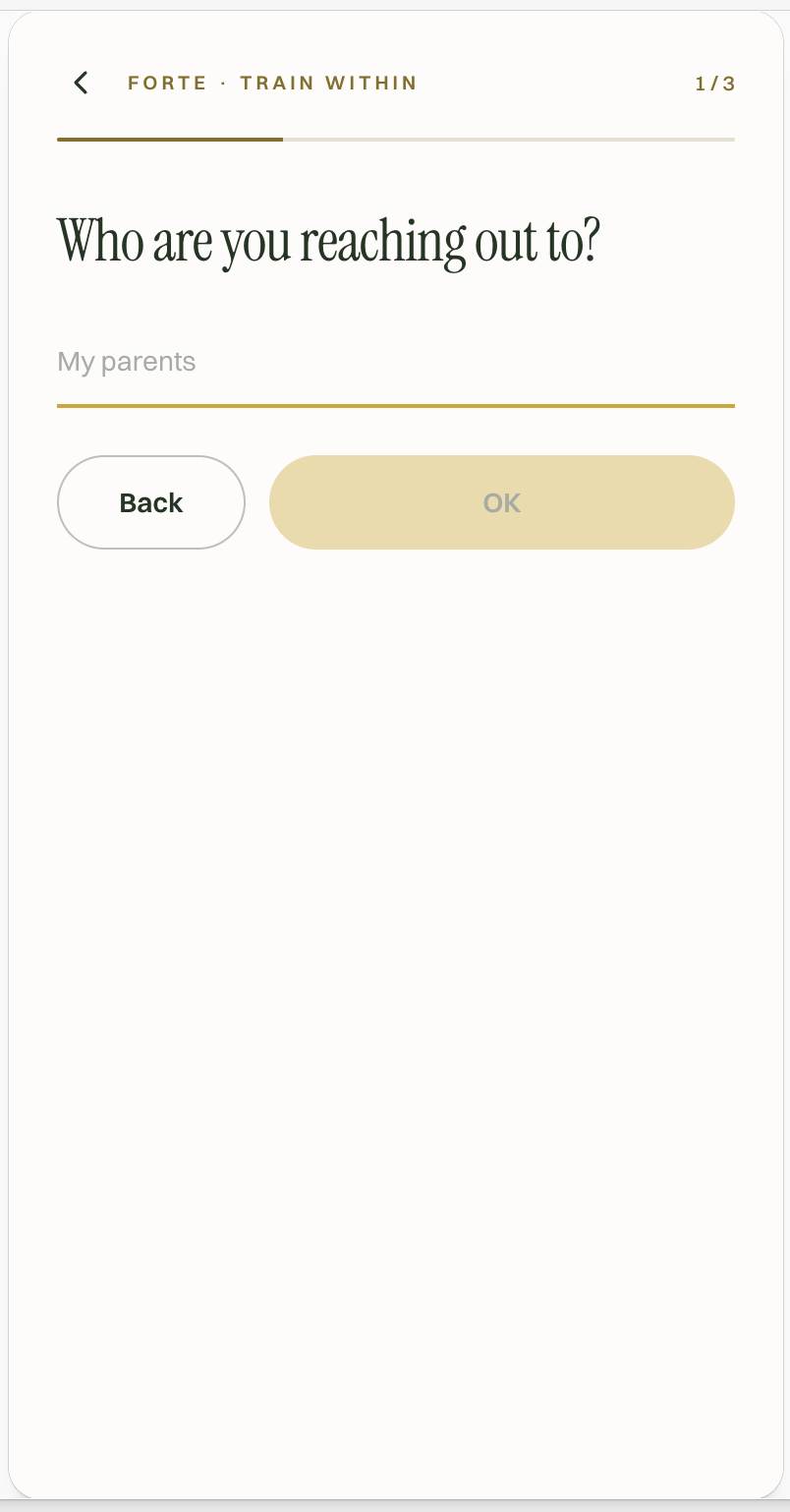
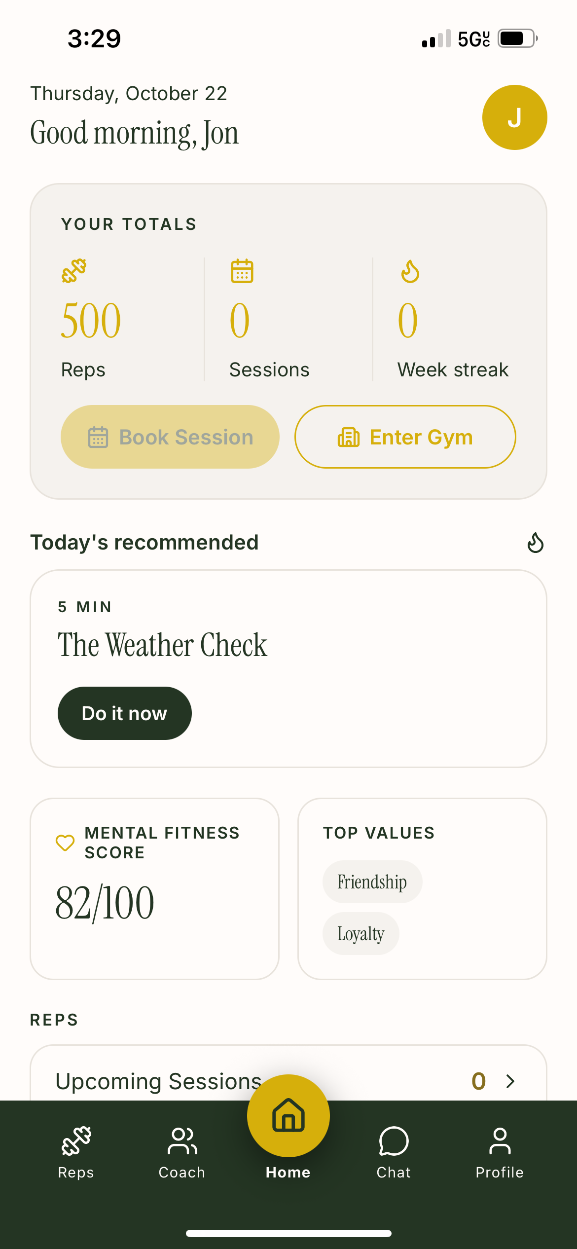
Choice: I gave the Gym equal weight alongside Sessions, side by side on the main screen. In Lovable, I built the Weather Check Exercise as the template for every other Exercise, so new ones stay consistent and are faster to build.
Why: Forte wanted to give Members value beyond their one-on-one Coach Sessions, and that only works if the Gym is easy to find.
Result: Since Mental Fitness Exercises launched in September 2025, Members have completed almost 6,000 of them, and about half came in the past 5 months.
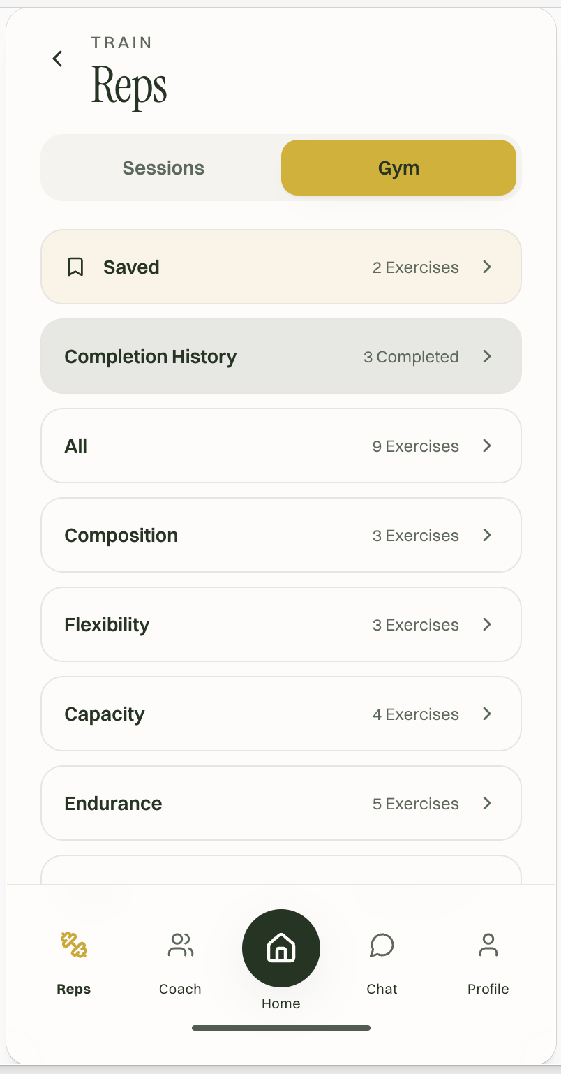
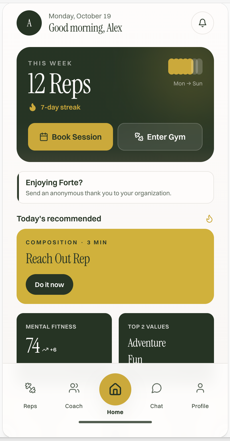
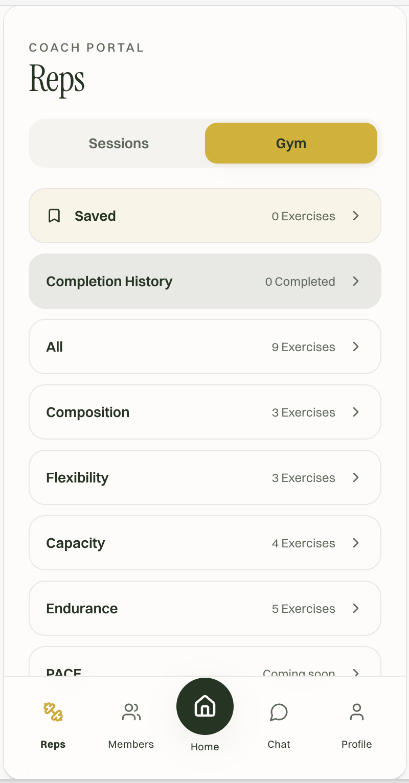
Lovable Dashboard Design
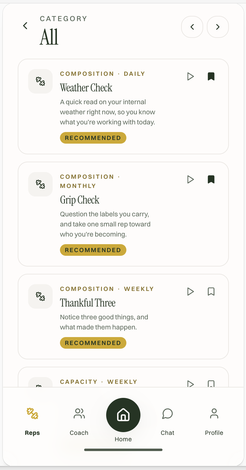
Gym and Exercise Screens
→
In-app Member feedback
Problem: There was only one place in the app for Members to leave feedback.
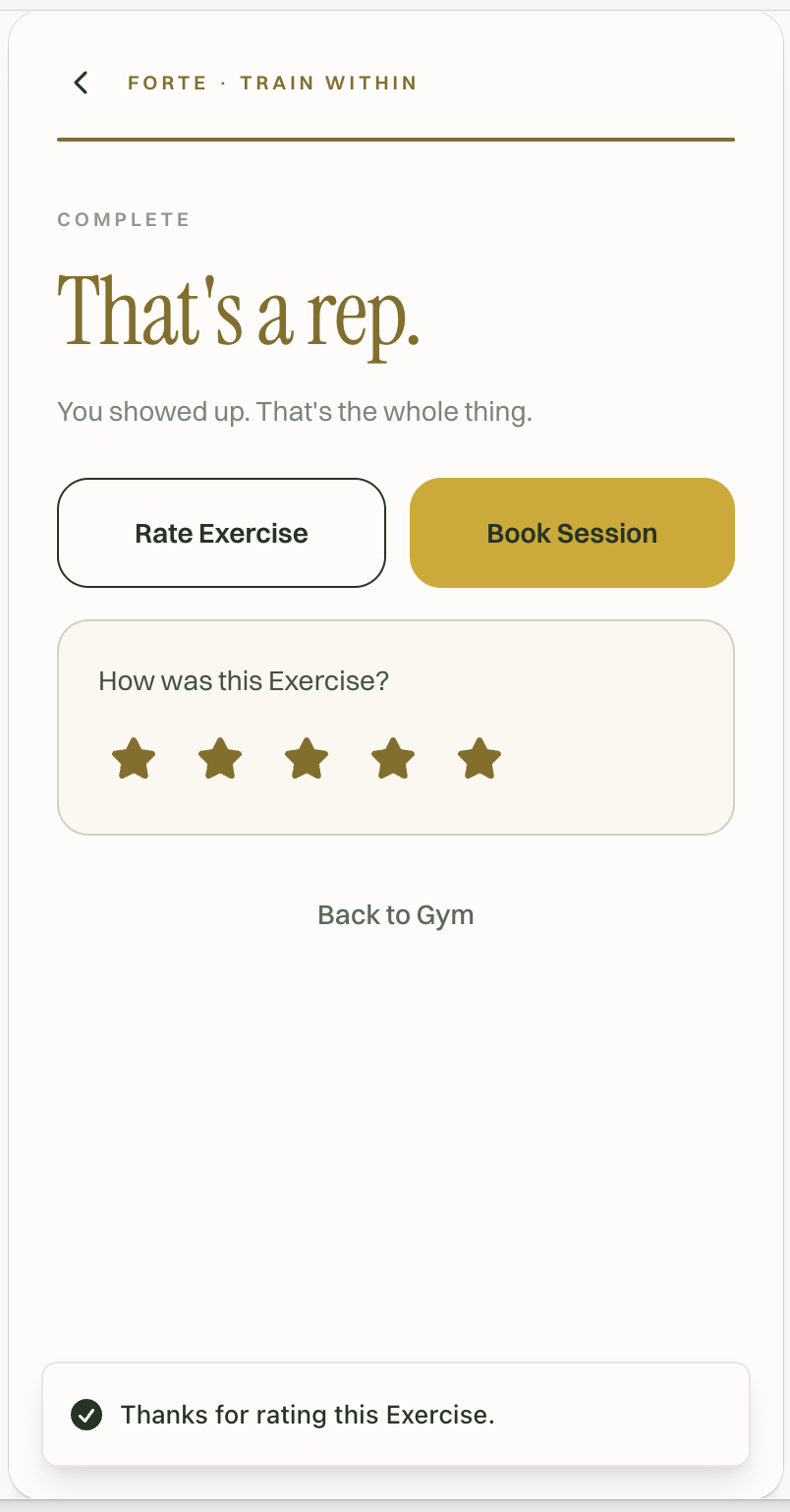
Choice: I added a feedback step after each Exercise.
Why: It gives the team data to improve individual Exercises, and lets Members track their own progress.
Result: The team now has per-Exercise ratings to see which Exercises land and which need work, and Members can see the Exercises they’ve completed.
Collaboration and handoff
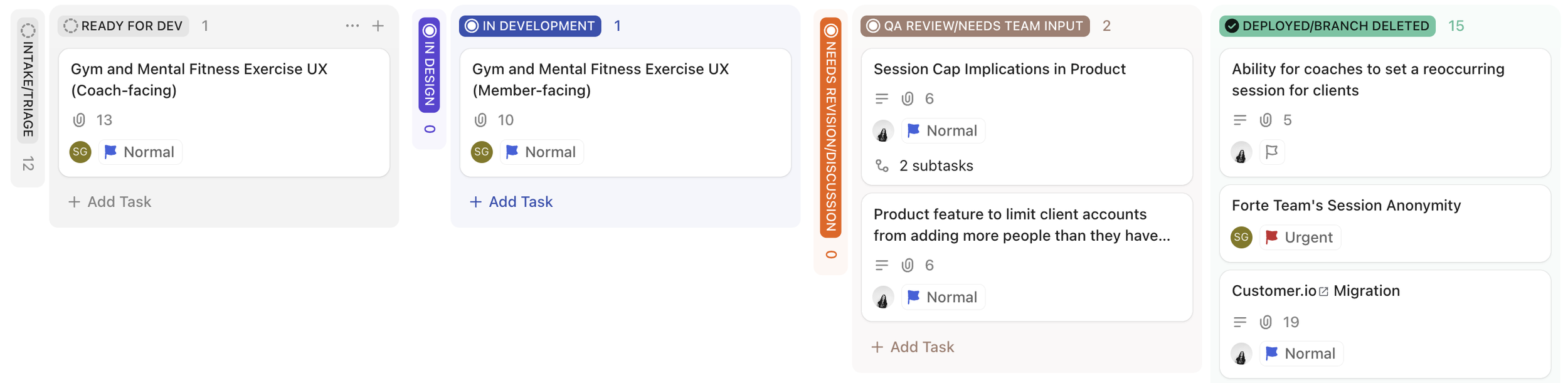
I turned designs into dev-ready work through ClickUp tasks with scope isolation, diff documents, and a Notion source of truth, so developers always knew exactly what to build and what not to touch.
Outcome
The redesigned Bubble.io app is live. We’re migrating to the new app in phases: first Forte’s internal team and two Coaches, then a first pool of Members and Coaches, then everyone.
Beyond the Member app
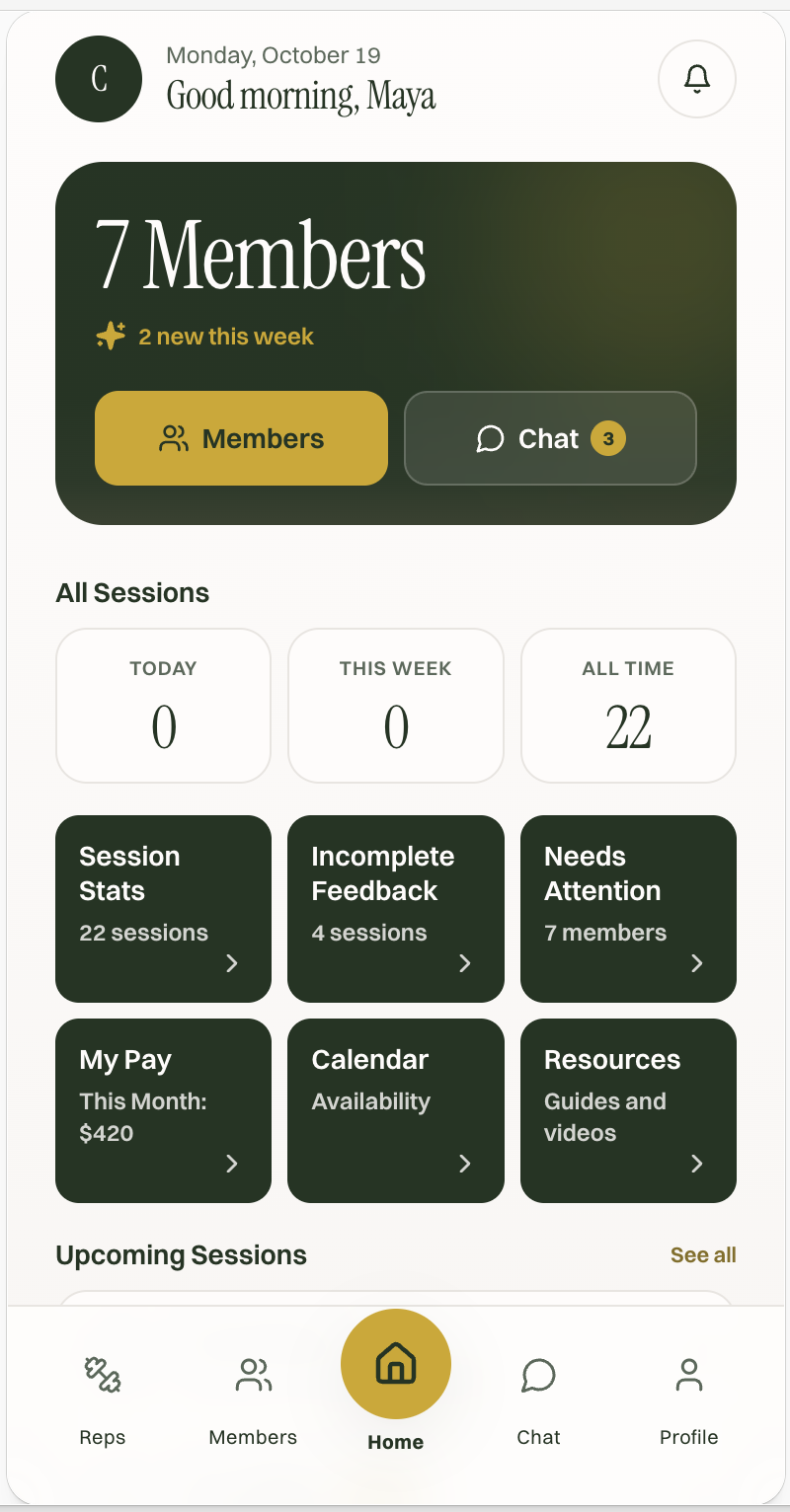
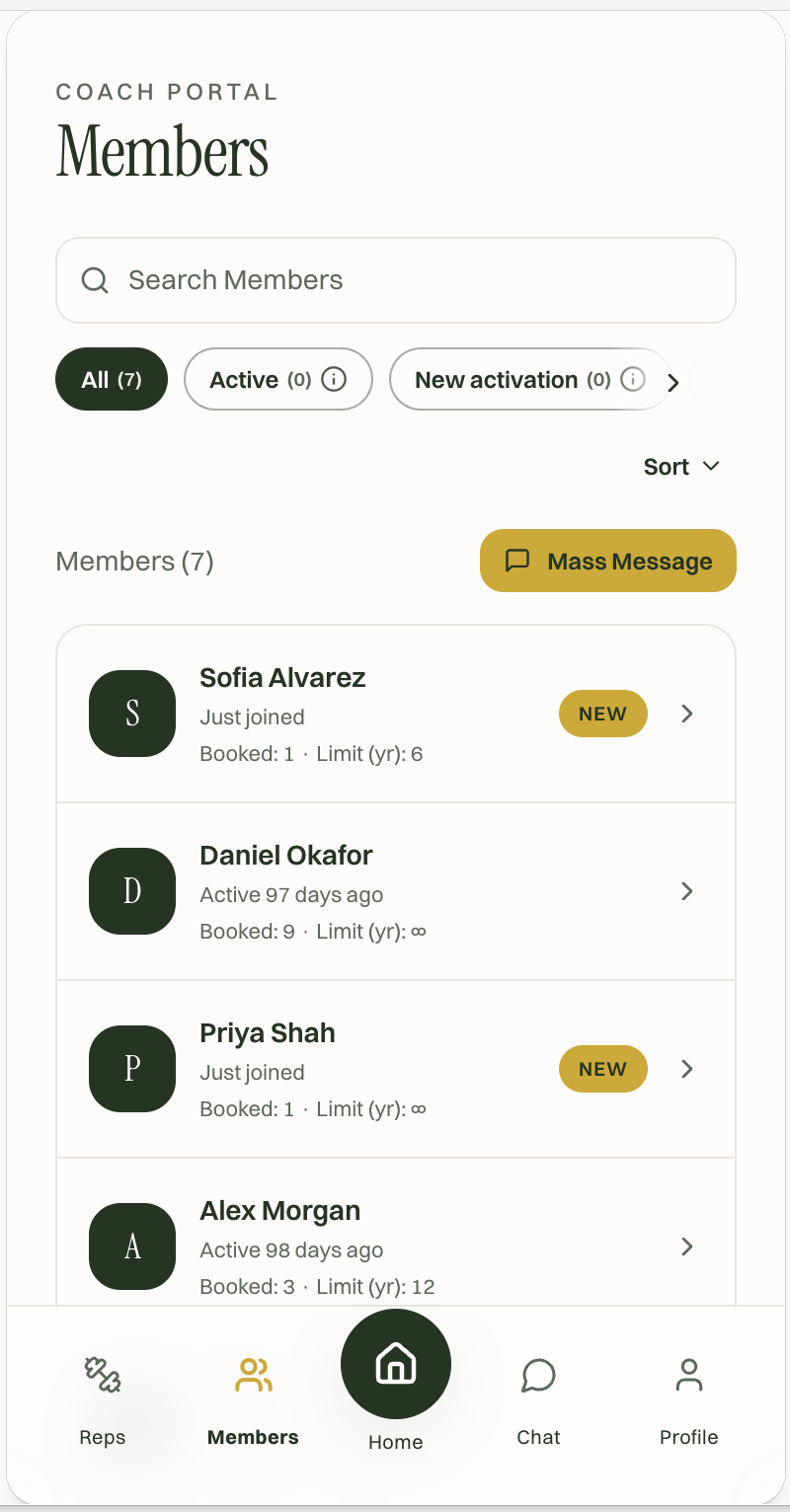
I also redesigned the Coach interface in Lovable, which is currently being built.
Reflection
What I’d do differently: I’d spend more time refining the Lovable designs before handing them off, so our Lead Product Engineer isn’t building on screens I’m still changing.
What I learned: How to turn design work into clear, manageable dev work through tasks, scope docs, and PRDs, and how to run user testing that’s productive without being expensive.
Lovable Prototype
Current Stage of App Dev
→
ClickUp Sprint Board
Post-Exercise Feedback Screen
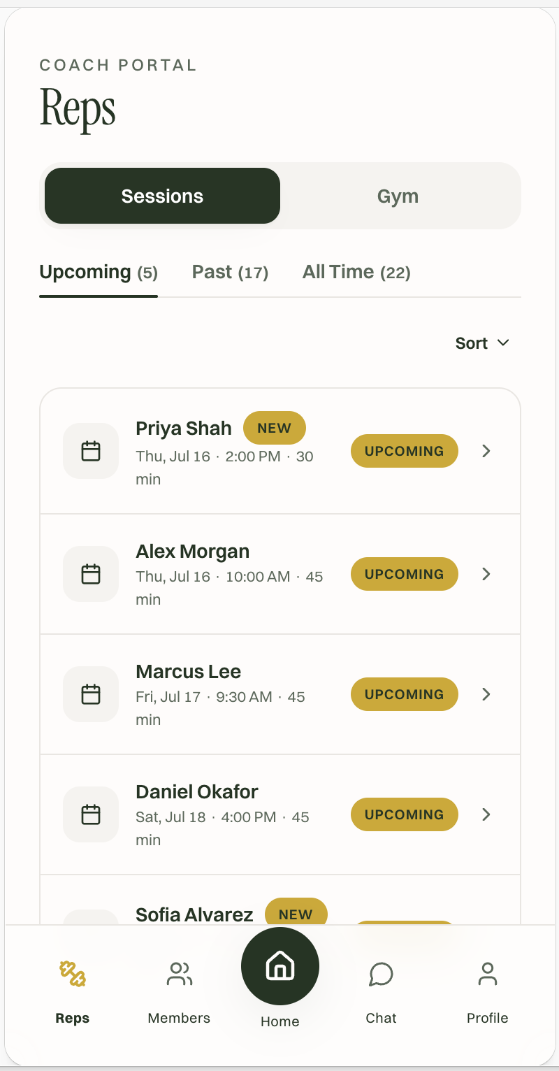
Coach Screens