Pete’s Little Lunch Box
A mobile ordering web app for a food truck near Drexel’s campus.
Role: Project Manager and Secondary Data Architect
Team: Me, a lead UX/UI designer, a lead coder, and a lead data architect
Tools: Figma, Microsoft Teams, HTML/CSS/JS, PHP, MySQL
TL;DR
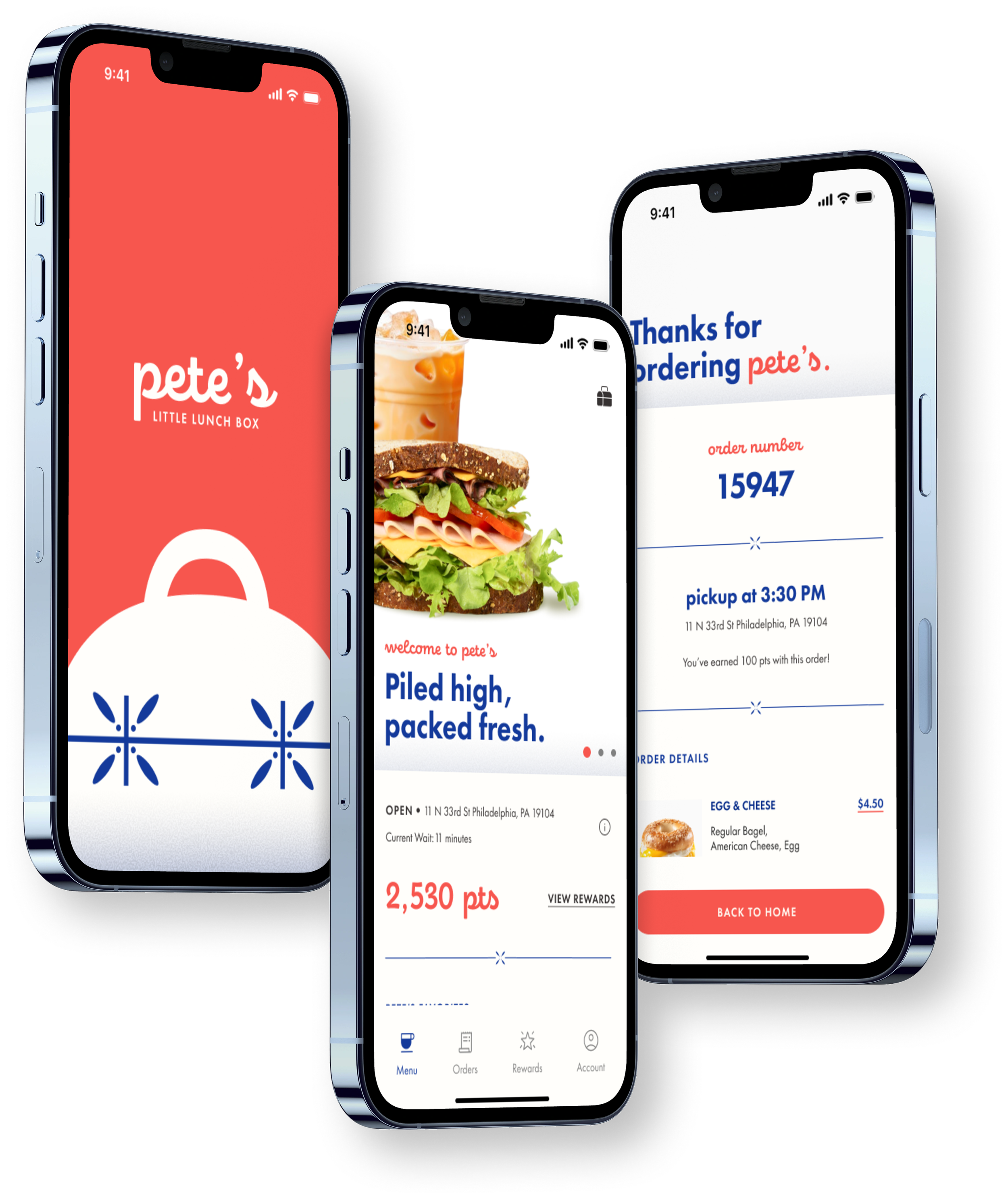
For Drexel’s UX Design II course, my team of four designed, tested, and built a mobile ordering web app for Pete’s Little Lunch Box, a food truck near campus. I managed the team, ran usability testing, and organized the data and media behind the app. The final app was deployed and earned an A.
Context
IDM 216 (UX Design II) challenged teams to take a prototype from UX Design I and turn it into a fully functioning web app through a full production pipeline. We chose Pete’s Little Lunch Box, a real food truck near campus. It wasn’t a client project, so we designed around the people who actually order there: students and faculty grabbing food between classes.
The problem
Ordering from a food truck usually means waiting in line, sometimes outside in bad weather, with no reliable way to check the menu or prices ahead of time. For students and faculty on a tight schedule, that wait can decide whether they eat at all.
My role
As project manager, I ran the team: assigning tasks on our Kanban board, scheduling reviews with our professor, submitting assignments, and representing the team in critiques. I turned feedback into specific tasks and filled gaps wherever the team needed help, including revising the prototype after professor reviews.
On the UX side, I helped create our personas and moodboards, co-wrote our usability test script and survey, moderated tests, and analyzed the results. As secondary data architect, I worked with our lead data architect to gather and organize the menu photography and maintain the media spreadsheet that fed the app’s database. Our lead UX/UI designer designed the interface, and our lead coder built it.
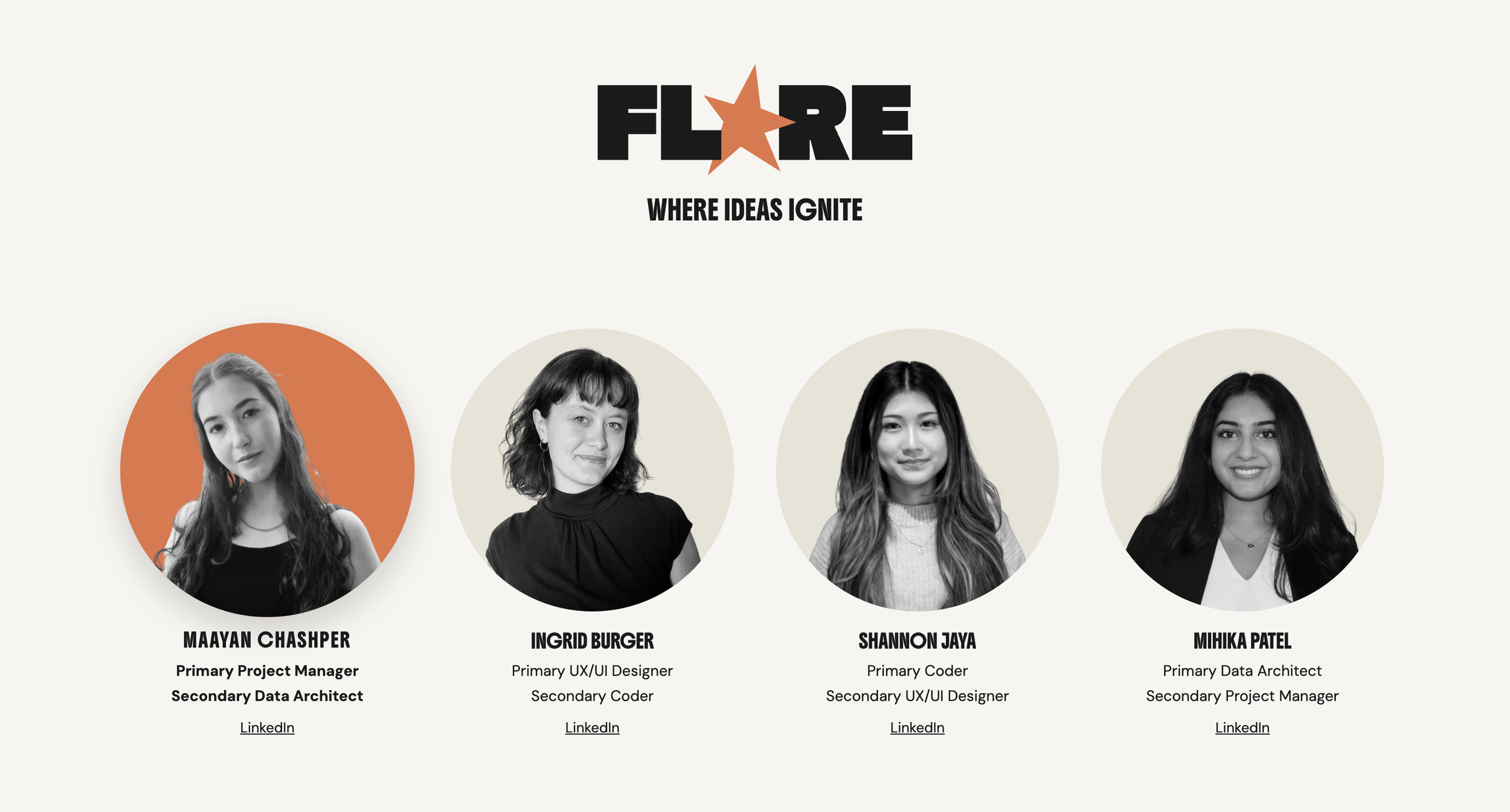
Team Flare Roles
Process
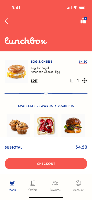
We started with user personas and moodboards to define who we were designing for and how Pete’s should feel. From there, the team built a style guide and a high-fidelity Figma prototype of the critical path: browse the menu, customize an item, check out, and pick up.
After professor reviews, we revised the flow, then ran two rounds of usability testing with our professor, members of other teams, and customers we interviewed at the truck. Testers completed tasks like finding and customizing a breakfast sandwich, placing an order, and checking order history. Testing surfaced issues like small text and confusing menu navigation, and we addressed them before the final build in HTML, CSS, JavaScript, PHP, and MySQL.
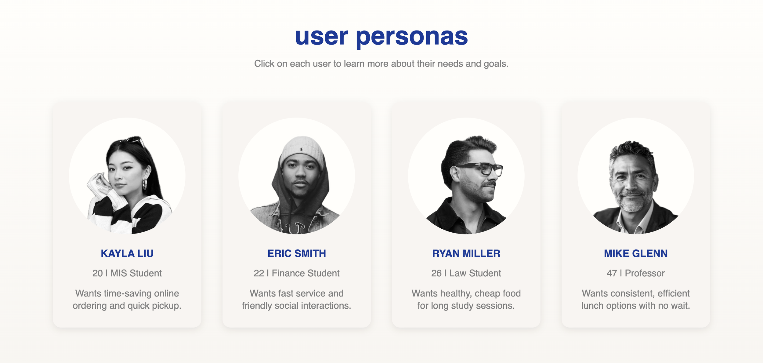
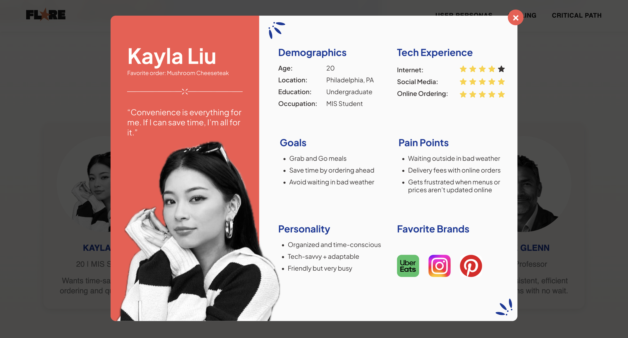
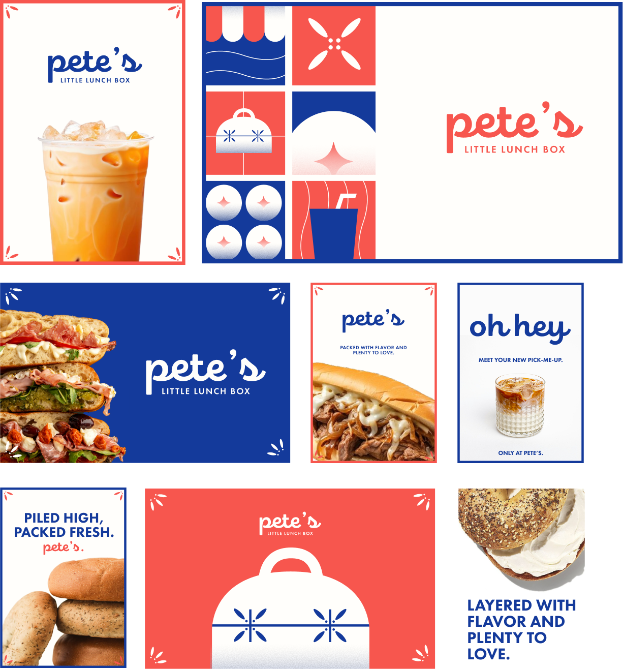
User Personas and Moodboard
Key decisions
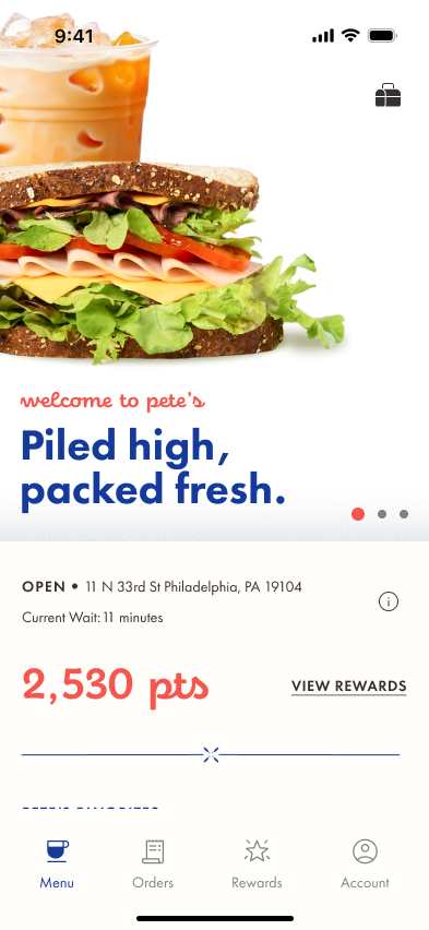
Menu first, login at checkout
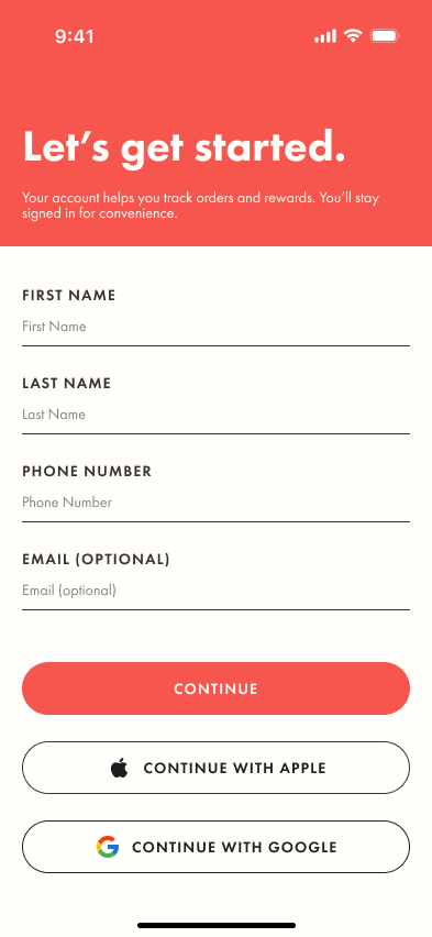
Problem: The first version asked users to log in before they could see the menu.
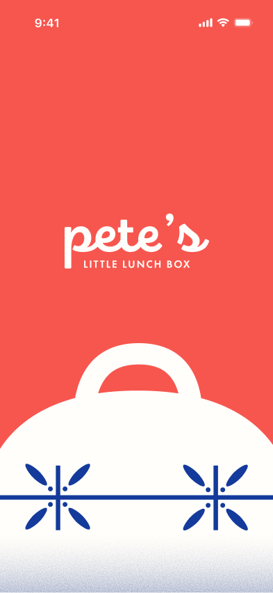
Choice: We made the menu the first screen after the splash screen and moved login to checkout.
Why: Someone ordering from a food truck wants to see what’s available right away. Asking for an account before they’ve decided adds friction and a barrier to entry.
Payment that matches ordering ahead
Problem: The original prototype offered cash at the truck, which meant still waiting at the window to pay.
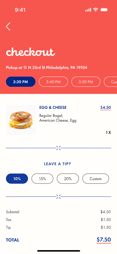
Choice: We removed cash at the truck and added in-app payment, with card entry in the prototype and a simulated Apple Pay checkout in the final build.
Why: Ordering ahead only saves time if pickup is truly grab and go. Paying in the app is also more reliable than handling cash at the truck.
Order Confirmation and Active Order on Home
Active orders front and center
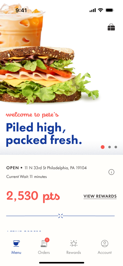
Problem: After ordering, users had to dig for their order details while waiting for pickup.
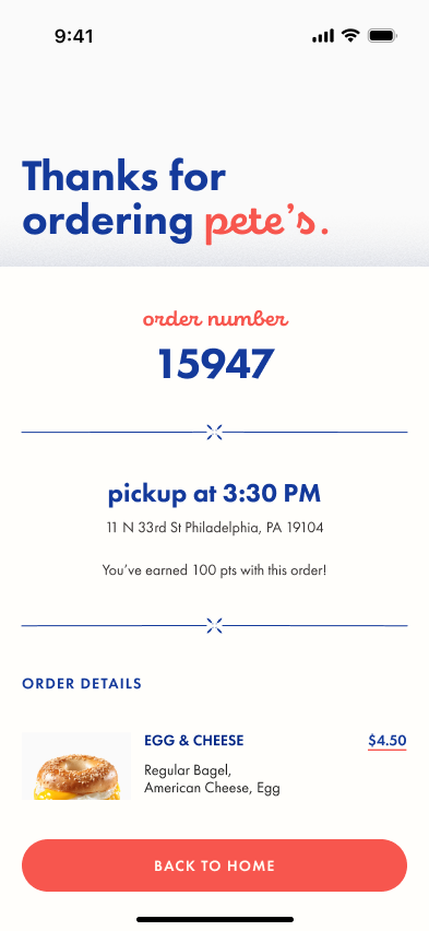
Choice: We moved active orders higher on the home screen and made the order number and pickup time larger.
Why: At the truck, the order number is what people show, so it needs to be visible at a glance.
The final web app was built, deployed, and earned an A.
⬆
Final Figma Prototype
→
Before: Login First → After: Menu First.
Outcome
Reflection
What I’d do differently: I’d start usability testing earlier, before the high-fidelity stage, so bigger flow issues like login placement surface sooner.
What I learned: How to keep a four-person team moving across design, code, and data, and how to turn testing and feedback into specific, assignable tasks.